BRAND REFRESH
Pride St. Louis is excited to share that our recent brand refresh was developed in collaboration with EightOne Creative, a local design studio led by the talented designer Eric Hammond and proud member of the LGBTQIA+ community. Supporting a local, queer-owned business was a key priority for us throughout this process, ensuring that our refreshed look authentically reflects the community we serve. This partnership allowed us to modernize our visual identity while staying true to our mission of celebrating, advocating, and educating for St. Louis’s diverse LGBTQIA+ community.

ARTHUR NUNN
As we look toward the future of Pride St. Louis, we’re excited to unveil our brand refresh, a bold new look created in partnership with a local designer that reflects the energy, diversity, and resilience of our community. This transformation goes beyond new colors and logos; it represents a renewed commitment to visibility, inclusivity, and progress. Our refreshed brand celebrates the spirit of Pride in St. Louis, honoring our history while boldly embracing what’s next.
PRESIDENT
We invite you to join us in this next chapter by supporting the mission behind the design. Your donation helps Pride St. Louis continue our work for the LGBTQIA+ community.

KYLE KLEMP
SECRETARY
We set out to create a logo that everyone in our community can see themselves in, one that reflects the vibrancy and diversity of our region. This new design perfectly encapsulates the mission of Pride St. Louis, and we’re thrilled to share it with our community. By creating multiple iterations of our logo, we are able to celebrate multiple identities while bringing everyone together under one cohesive and inclusive Pride St. Louis brand.
CHAIR OF COMMUNICATIONS
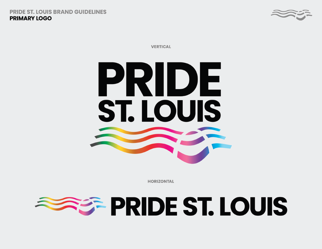
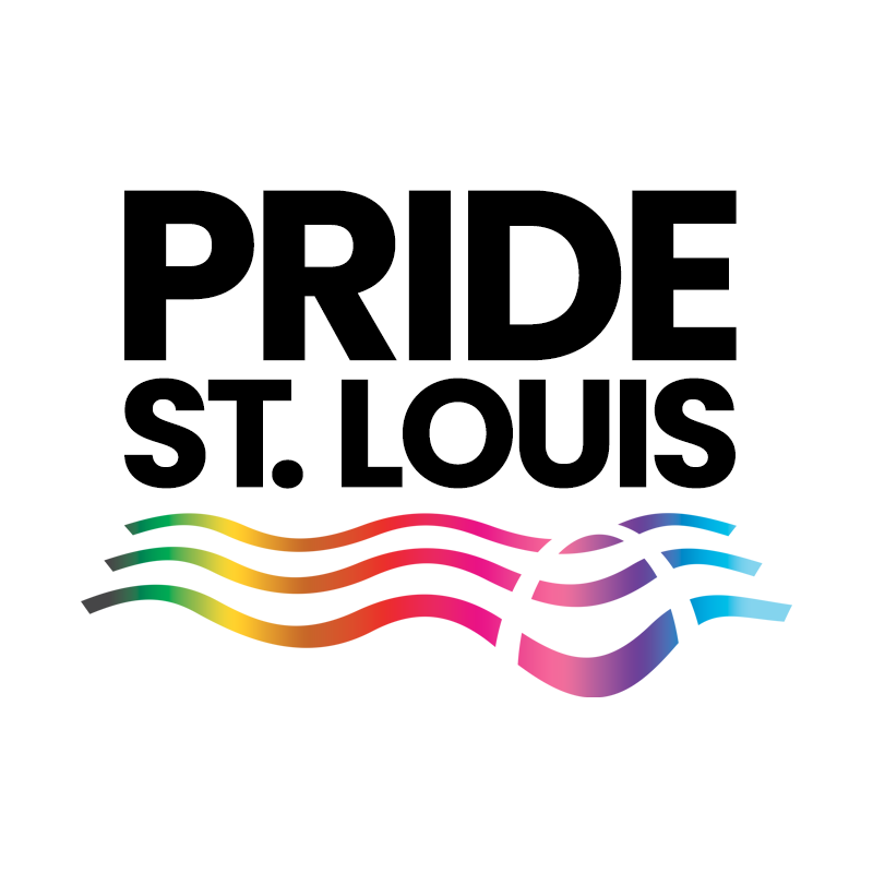
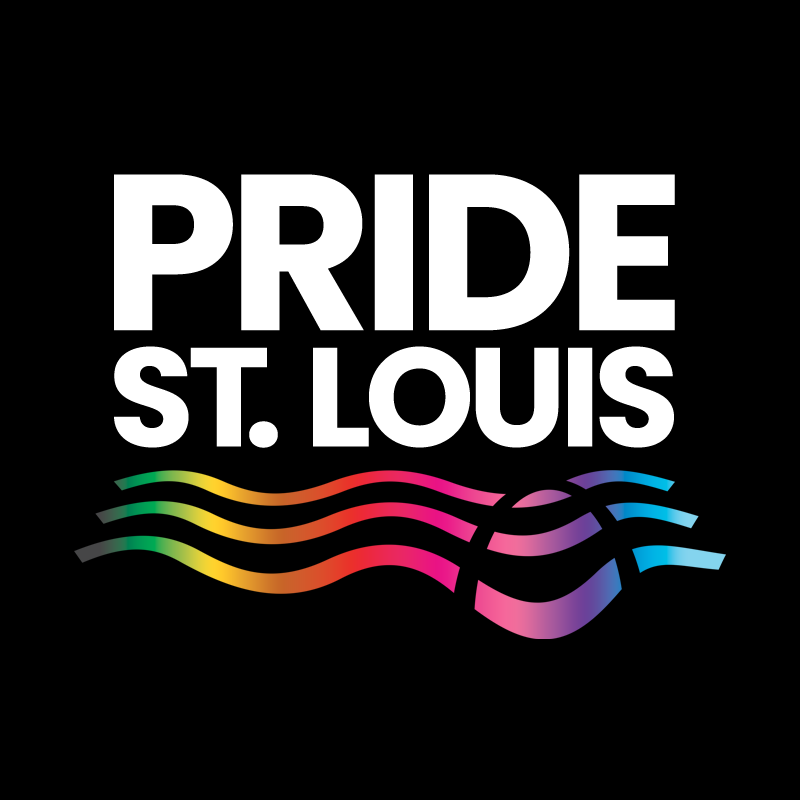
PRIMARY LOGO
LOGOMARKS


INTERSEX PRIDE
NON-BINARY PRIDE


PANSEXUAL PRIDE
TRANSGENDER PRIDE
BISEXUAL PRIDE
ASEXUAL PRIDE
CONCEPT

ERIC HAMMOND
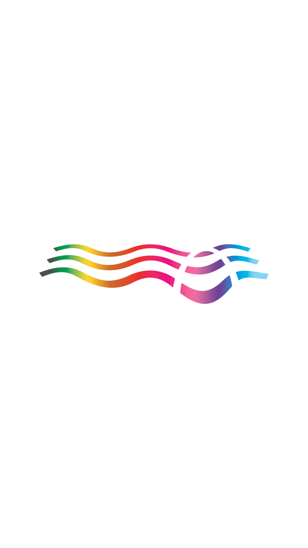
When creating the new visual identity for Pride St. Louis, my goal was to create something that truly represents the spirit and importance of both the organization and the city it calls home. St. Louis has such an iconic skyline and cultural identity, so I felt it was important to ground the design in a sense of place that ties directly to the city’s geography and symbolism. The bold typography gives the logo a confident, but welcoming modern presence and by no longer abbreviating ’St. Louis’ to ‘STL’, as in the previous logo, it gives more prominence to the city the organization calls home.
The flowing lines represent both the Mississippi River and a waving flag, capturing movement, unity, and pride in motion. Within those lines, a subtle cutout forms the shape of the Gateway Arch, creating a visual bridge between the St. Louis skyline and the Pride movement. This intentional negative space gives the design a strong connection to the city while symbolizing openness and inclusivity — a gateway that welcomes everyone. The gradient spectrum across the lines represents the diversity and vibrancy of the modern Pride movement, connecting every color and identity into one harmonious flow. It’s a visual reminder that Pride in St. Louis is both rooted in place and moving forward together.The design also features an adaptive gradient, designed to evolve across uses and narratives. This flexible color system allows the logomark to reflect different stories within the LGBTQIA+ community, emphasizing inclusivity and representation. For example, the gradient can shift to pink and blue to honor the transgender community, or adapt to other color combinations that highlight specific identities and causes. This adaptability ensures the logo remains both consistent and expressive as the Pride movement, and the colors that represent it, continue to grow.Additionally, the logo was designed to expand and adapt for various Pride St. Louis events and initiatives, such as PrideFest and Pride Idol, allowing each event to maintain a consistent visual identity under the larger Pride St. Louis brand. This flexible system builds brand equity and recognition while ensuring every event contributes to the organization’s unified presence and lasting impact within the community.
The fight for equality is never-ending, and I hope this new visual identity catapults the organization forward into a new era of advocacy and activism. I’m proud to play even a small role in that effort.CLICK BELOW TO REVIEW OUR BRAND GUIDELINES